A look that survives
forty sectors.
Identity work is not a logo; it is the set of rules that keeps the hundredth asset looking like the first. That system is what gets built here, and then it gets tested at volume.
The house style is the deliverable.
Before anything is generated at volume, a look specification is fixed: palette, type hierarchy, how photography is lit, where the lockup sits, and how Arabic and English share a composition rather than one being dropped into the gap left by the other.
Everything after that is held to it. Work made in different sessions, for different sectors, by different hands, reads as one studio — which is the only reason a set of forty is worth more than forty single images.
Delivery includes the provenance: model, prompt and seed documented, so the look can be extended next year by someone else without it quietly drifting.
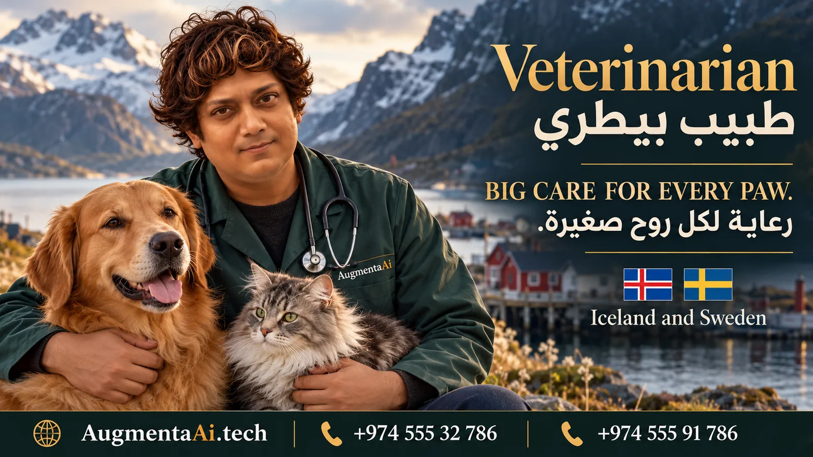
The same frames rebuilt for Germany and for Iceland and Sweden. The market, the setting and the market marker change; the structure, the type hierarchy and the lockup do not.

International Campaigns
Dental practice — Germany
The sector campaign system localised: same bilingual structure, a German market marker, and a tone pitched at a European clinic rather than a Gulf one.
International Campaigns
Veterinary — Iceland and Sweden
The same frame built for two Nordic markets, flags included, against a mountain setting rather than a Gulf one. The house style holds; only the market changes.